Over the course of an 8 month period, I tracked the movement of a pony in a couple of different management settings – stable yard, small paddock, small track, large track and recorded the information, which can be found here.
While I was collecting tracking information for particular areas, I noticed something quite unexpected. As the temperature went down, so did the pony’s distance travelled. This contradicted what I’d expected, which is that when it gets cold, a horse will move around more to keep warm.
The more information I collected, the more it became clear that the relationship between temperature and distance travelled changed depending on the area and the location of the incentives, so I thought I’d wait until all the information was in, before looking at it objectively to see what the patterns told me.
You can find a summary of the distances travelled in each area and definitions/ descriptions of each area here. Each of the graphs below, represents the information for the relevant area from the Monitoring Detail spreadsheet.
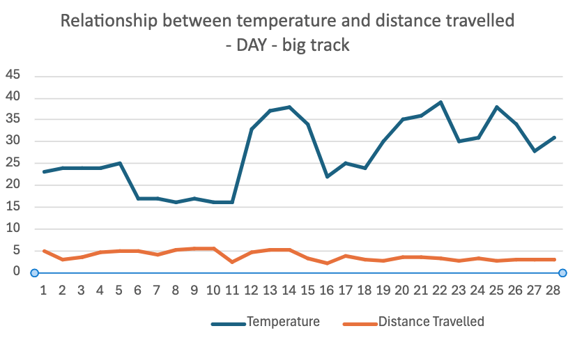
This graph represents the movement of the pony in a roughly 725m track, with hay and water spaced relatively far apart.
Although the maximum day time temperature fluctuates between 15 degrees C and 40 degrees C, there doesn’t seem to me any relationship between temperature and distance travelled.
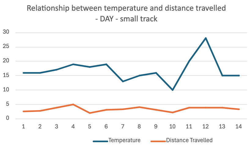
This graph represents the movement of the pony in a roughly 130m track, with hay and water spaced relatively apart.
Although the maximum day time temperature fluctuates between 10 degrees C and 30 degrees C, there seems to me to be only a very minor relationship between temperature and distance travelled.
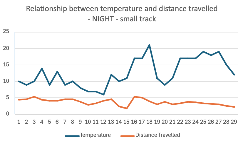
This graph represents the movement of the pony in a roughly 130m track, with hay and water spaced apart. Hay is provided in a limited quantity at the start of the session or around 6pm and again at 9pm, with one bag for each horse, placed relatively close together.
Although the minimum night time temperature fluctuates between 5 degrees C and 21 degrees C, there seems to me, to be only a very minor relationship been the temperature travelled.
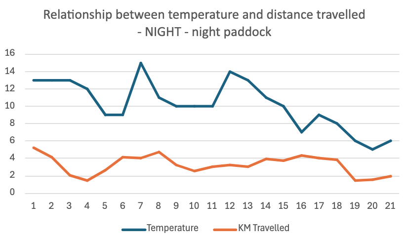
This graph represents the movement of the pony in a 30m x 40m paddock with an unlimited supply of low sugar hay in a central position (hay roll).
The minimum night time temperature fluctuates between 15 degrees C and 5 degrees C but there seems to me, to be a more noticeable correlation between the two trend lines.
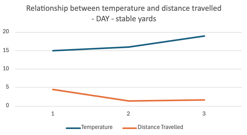
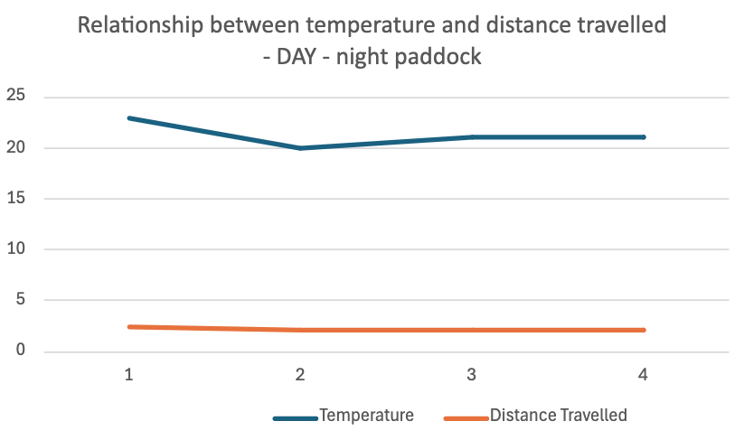
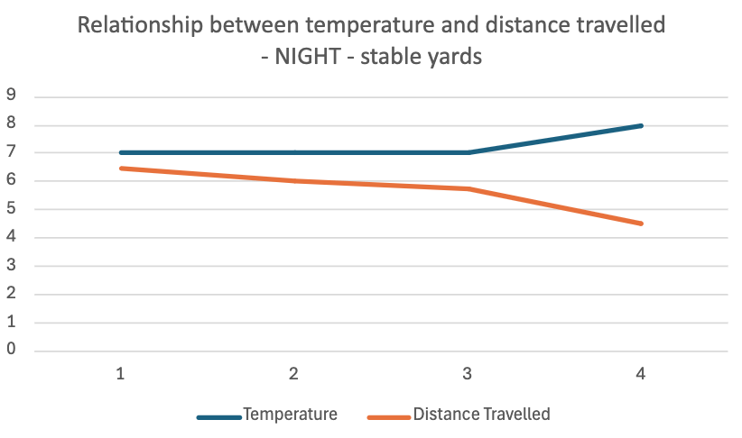
The remaining three sections of the data summary didn’t have enough information to establish trends, but I’m including them here for completeness.
Observations
You can probably interpret these graphs in a number of ways. Here’s how I’ve interpreted them.
Conventional wisdom suggests that when it’s cold, horses will move around more to stay warm, because that’s what they would have to do in nature when we’re not around to interfere.
But that’s only half right. From these graphs, it looks to me like they will move around more, unless there is a more efficient way of warming themselves up, like an unlimited supply of energy-rich food for example, which is definitely not a feature of nature.
In nature, there are no hay rolls or all-you-can-eat paddocks. Like animals of the African savanah, horses range in a cyclical pattern that will take in areas with lots to eat, areas with not much to eat, but proximity to water/shelter/minerals etc. So their default setting is to keep moving, to make sure they keep getting access to the most efficient way of warming themselves up, which is whatever food they can get hold of.
This situation more closely resembles a track setup than a paddock setup, regardless of how big either one is.
In the graphs for the tracks, movement is somewhat correlated with temperature but in the graph for the night paddock, from what I can see, there is a direct correlation. The colder it gets the less they move, so that they can spend more time eating.
If you’ve reached other conclusions, I’d love to hear them and the best place to do that is on the Home Track Facebook page,
I’ve included all the graphs in a scrolling format as it’s easier for me to compare them that way.